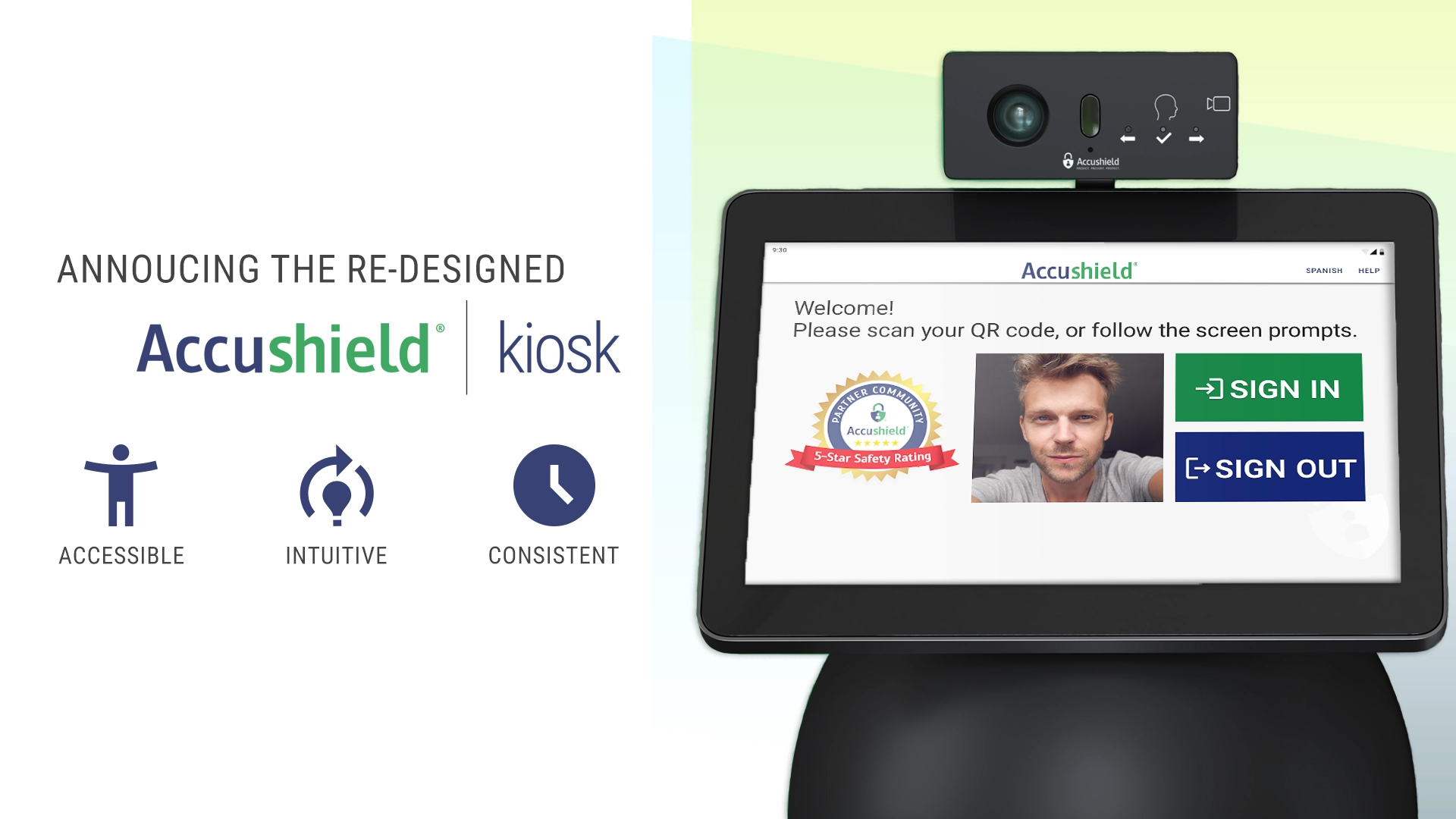
Accushield is excited to announce the upcoming launch of our new look and feel of the Accushield kiosk, a sign-in and health screening application in senior living, skilled nursing, and healthcare facilities.
You probably have some questions.
Here are some FAQs, just for you:
Why do we need a kiosk redesign?
This introduces a new look and feel to the application, but there’s a deeper purpose behind the changes than may initially meet the eye. The benefits of the Accushield kiosk redesign to our customers and kiosk users can be categorized into three primary pillars.
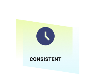
Consistent
A reusable and responsive design system leveraging ISO standards and iconography provides for a consistent, easy-to-use experience across devices and screen sizes. This includes:
- Font selection optimized for readability on screens of varied sizes
- Consistent, clear internationally recognized iconography and screen layout
- Data entry captured in international standards order (ISO)
- Vector graphics that scale across devices without distortion
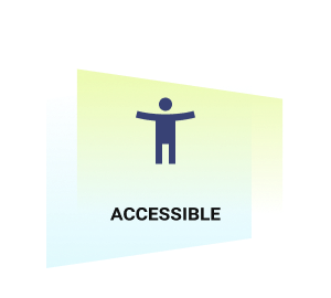
Accessible
Designed to meet local, state, federal and international guidelines for accessibility, the Accushield kiosk meets US government and international compliance standards (ADA/US 508 and international WCAG 3 compliance). This “designed for all” approach includes:
- Larger enhanced touch targets — design to account for two finger touch, based on geriatric usability research
- Colors that support visual acuity/impairment issues like color blindness
- Optimized contrast ratios ensure all users can perceive the information on the screen
- Simplified, positive, and purposeful directional language to guide users through the sign-in process
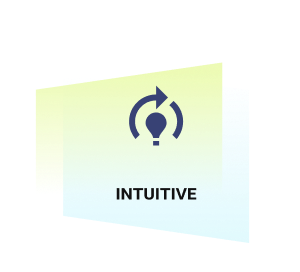
Intuitive
Design thinking and mental models focus on guiding a kiosk user in an obvious and intuitive way toward completing sign-in process as efficiently as possible. Contributing to an intuitive user experience are:
- Consistent directional text in the top left of each screen
- Clear assistive text — like tooltips and calls to action
- Explicit interaction states that reenforce the user’s choice
- Consistent use of the same interaction patterns with only purposeful interruptions for errors, alerts, and messaging
A lot of research, planning, development, feedback and testing has gone into the refreshed look of the Accushield kiosk.
“We spent several months researching, engaging in design thinking and studying geriatric usability needs,” says Colleen Caporal, Director of Experience Design. “We then applied ADA US 508 and WCAG 3 standards to our design. Our new look and feel scores exceptionally high on standard accessibility measurements; making it accessible and easily usable for more of the population. We are excited to roll this out to our customers!”
Who gets the updated look and feel? When do I get it?
All Accushield customers, on all kiosk models, will be receiving the kiosk redesign. The updated interface will begin rolling out to customers in a phased release beginning the first week of May 2022.
What do I need to do?
The kiosk redesign will be released like a standard Accushield kiosk update. Customers won’t need to do anything to their kiosks in order to use the new interface. Administrators will be notified by email when their update is scheduled and the new kiosk build will be pushed overnight.
What’s next?
Accushield will continue to improve all application experiences (kiosk, mobile app, and dashboard), making them more consistent, accessible, and intuitive for all users. Stay tuned for more!
###
Accushield is a healthcare technology company. Our onsite hardware and software provide visitor/staff management, infection prevention and control, and health/safety compliance via automation and reporting.